
Blog
The Map Is Not the Territory. Neither Is the As-Built.
Every plant room runs on maps that quietly stopped matching the building: as-builts, BMS graphics, single-line diagrams. What Korzybski, Borges and a spinning fan icon teach about which maps to trust.
 Tan Kok XinThe Essay Series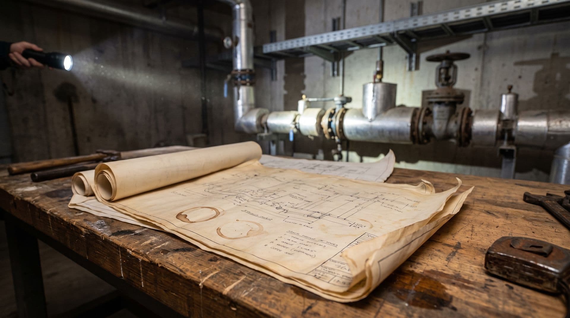
In December 1931, at a science meeting in New Orleans, a Polish-American scholar named Alfred Korzybski delivered the one sentence he is still remembered for: "A map is not the territory it represents, but, if correct, it has a similar structure to the territory, which accounts for its usefulness."
Here is the idea in plain words: every drawing or model of a real thing is a simplified copy. The copy can be wrong, and the real thing keeps changing underneath it. Korzybski was honest about where he got it, crediting the mathematician Eric Temple Bell's earlier line, "the map is not the thing mapped." The paper was reprinted in his 1933 book Science and Sanity, and the phrase never left.
Fifteen years later, Jorge Luis Borges and Adolfo Bioy Casares wrote the punchline. Hiding behind a shared pen name, and quoting a fake book dated 1658, they published a one-paragraph story. In it, an empire's mapmakers build a map at 1:1 scale, covering the empire point for point. The next generation judges it useless and abandons it to the desert sun.
(Lewis Carroll got there first in 1893, with a mile-to-the-mile map that was never unfolded. The farmers said it would block the sunlight. "We now use the country itself, as its own map.")
Funny story. Now walk into your own plant room.
In short
- Alfred Korzybski's 1931 line, "the map is not the territory," applies directly to a building's as-built drawings, which are a map, not the building itself.
- An as-built drawing is accurate on the day it is filed and starts drifting from reality the moment anyone touches the building afterward.
- The only map that stays accurate is one that redraws itself continuously from live data, rather than one filed once and trusted forever.
- Treating drawings as gospel, rather than checking them against current sensor and equipment data, is a common source of wasted troubleshooting time.
The map is not the territory (and the as-built is not the building)
Every facility engineer in Malaysia inherits a stack of maps.
There is the as-built drawing, where the contractor rerouted a chilled-water line in the final week and nobody ever drew it. Missing and inaccurate as-builts are a documented top cause of disputes in building maintenance work. Not an occasional annoyance. A pattern.
There is the BMS graphic that still animates a chiller you removed two retrofits ago. The little fan icon spins. The actual chiller is scrap metal somewhere in Klang.
There is the single-line diagram that matched the switchboard right up until the third tenant fit-out. And there is the digital twin, sold as the territory itself. The research literature quietly notes that BIM captures a static snapshot, and twins drift without regular updating.
Here is the part worth stopping on. None of these maps failed by being wrong on day one. Most were accurate at handover. They failed because the building changed and the map did not.
Worse, the map did not look changed. Borges' map at least rotted visibly in the desert. A PDF as-built looks just as crisp in year ten as it did in year one.
The only map that redraws itself
People quote the first half of Korzybski's sentence and skip the useful half. A correct map, he said, has a similar structure to the territory, and that structure is what makes it useful. So the engineering brief is simple. Prefer maps that keep checking their own structure against the territory.
Live measured data is the only map that redraws itself. A power meter on the chiller plant does not care what the as-built says. It reports what the building actually did in the last minute. Anomaly detection is really just the map confessing, in real time, where it disagrees with the building.
This is why we built CobiNeural as an overlay on the BMS, PLC and SCADA systems you already have. It is not another map claiming to be the territory. It is a layer that keeps checking the old maps against live measurement.
One honest catch, though. Gregory Bateson pushed the idea further in 1972: even perception is mapping, "maps of maps, ad infinitum." Sensor data is also a map. It is shaped by where you placed the sensor, how often you sample, and how far the calibration has drifted.
An Oak Ridge National Laboratory study found that slowly developing sensor faults alone swung a simulated office building's site energy from −3.3% to +18.1%. Your instruments can quietly redraw the map too. It is also why your sub-meter never exactly matches TNB's meter. They are two different maps of the same territory.
The goal was never to reach the territory. The goal is maps that admit their errors.
Where the metaphor breaks down
A fair warning before you quote this at your next management meeting. You cannot run a building without maps. The single-line diagram is a safety document, and nobody should isolate a breaker on a guess. So "distrust the map" must never become "throw away the map."
Measured data is not the territory either. It is a faster-updating map, as those sensor-fault numbers show. And Borges is a little unfair to detail. Sub-metering a chiller plant is added detail that usually pays for itself; the real sin is detail nobody maintains.
Buildings also change slowly, so a ten-year-old drawing is often mostly right. The practical rule is calibrated trust. Know how old each map is and how wrong it tends to be, and keep updating the ones that matter.
The statistician George Box wrote in 1976 that all models are wrong. A few years later he sharpened it: some are useful. In a building, the useful maps are the ones that know how wrong they are, and say so this week, not at the next energy audit.
If you suspect your as-builts and your building stopped agreeing a few retrofits ago, we can help you find out where. Book a short demo and we will put a map next to your territory, live.
FAQ
Frequently asked questions
Ask us about this topic
Something in this article you want to dig into — or a situation in your own building it doesn't quite cover? Send us your question. We don't run public comments; the team replies to you directly by email.